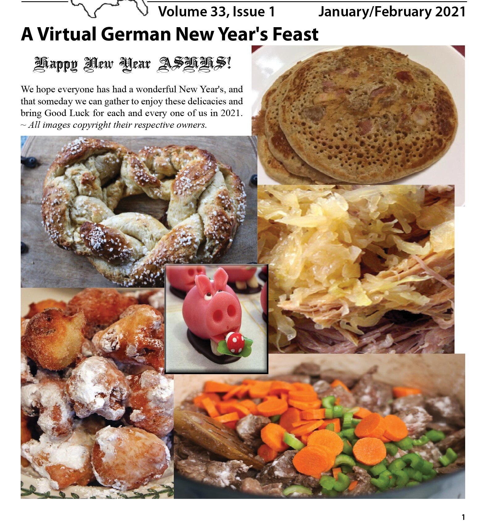
A Tempting Feast
This German heritage society canceled all its 2020 gatherings due to the pandemic. For the 2021 New Year’s issue, I wanted to give the readers a traditional German New Year’s feast, but also prompt them to have this feast once they can meet again in 2021. I designed it with some slightly overlapping pictures of food to represent a dinner placement. But also wanted to add the German good luck symbol of a pig in the center to wish everyone a great New Year. I add some 3-D beveling and border to that picture make it pop and draw the reader’s eye inward.

Historical Letters
A reader graciously provided some personal letters from family members living in Germany after World War II to their Aunt in America. To create that letter image, I used a graphic that depicted aged paper with a crease to simulate a folded letter. I wanted to use a script typeface that was readable without breaking the letter’s solemnity. I decided that Bradley Hand ITC was the best choice. To introduce the letters, I researched and found a quote from British Field Marshall Montgomery to set the tone and environment following the war.

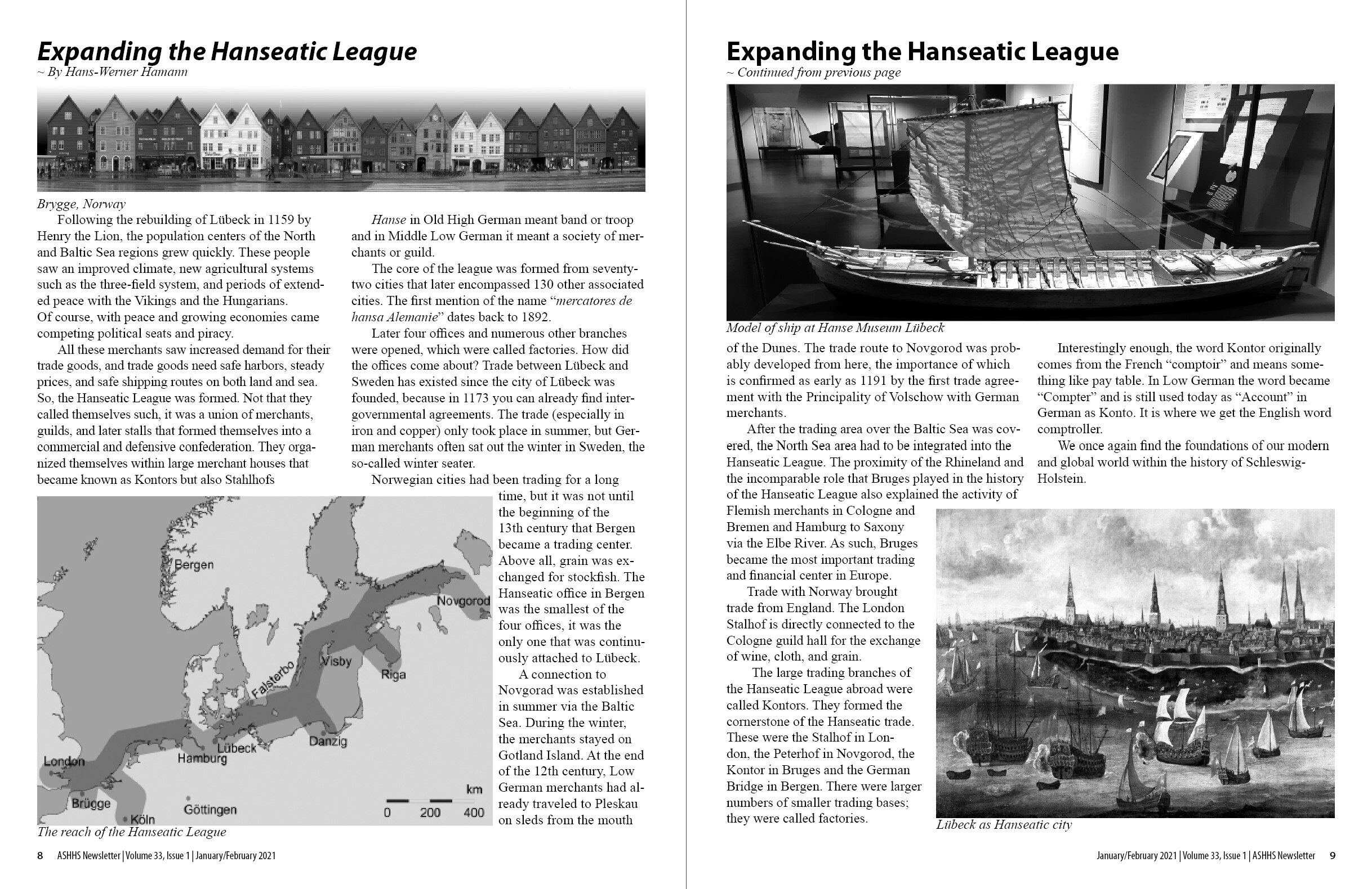
Creating Balance on Facing Pages
When creating facing pages of various shaped pictures with a single text, I find it vital to ensure that each page balances its facing page. Symmetry is not always the best option because these pictures have different aspect ratios. And symmetry is sometimes boring. So I chose an asymmetrical alignment staying true to the pictures and roughly balancing the text between the pages.

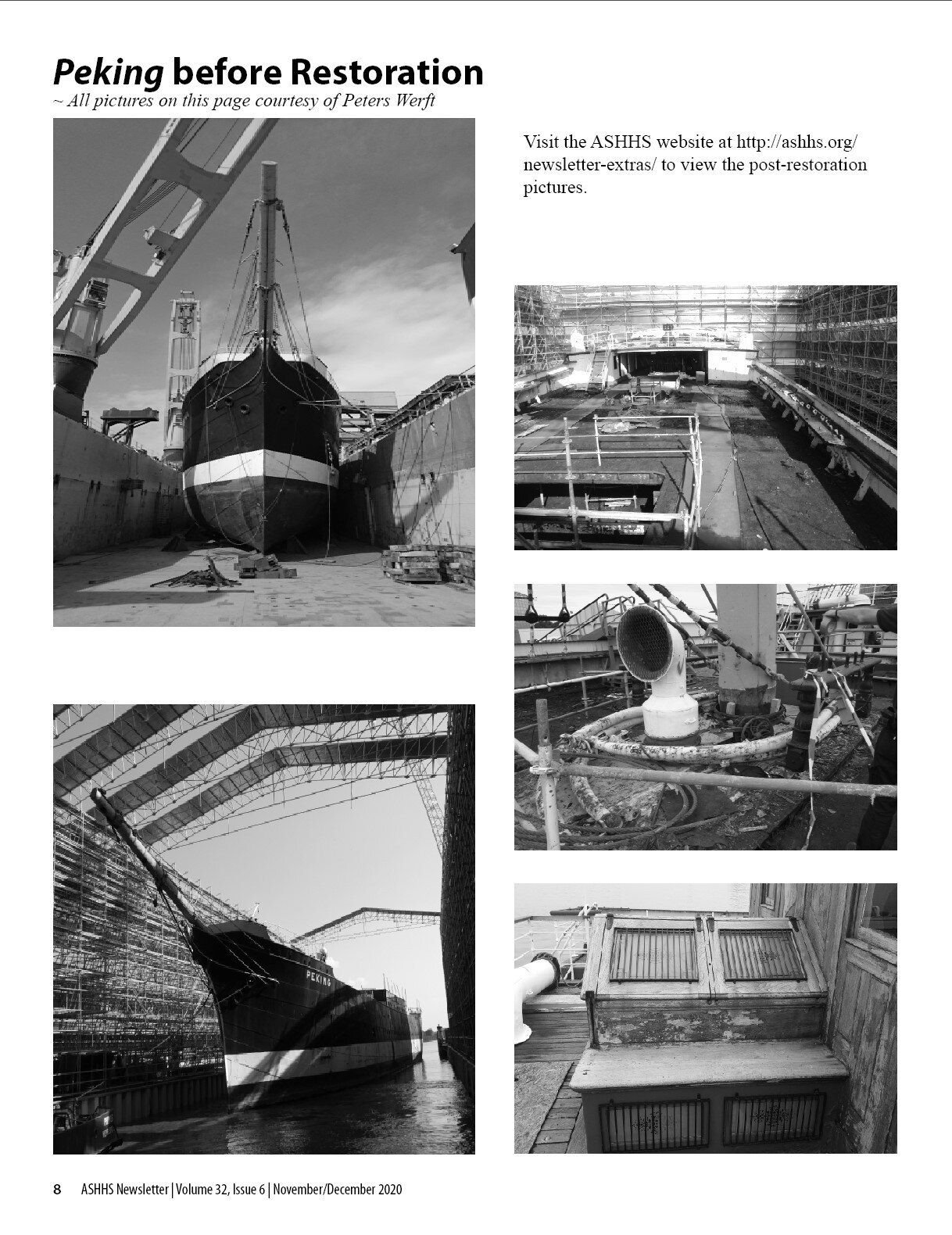
Picture Alignment
Unless I’m trying to create a unique presentation as I’ve already displayed on this webpage, I usually try to arrange pictures with significant use of negative space or gutters between the pictures. It is important to keep your reader’s eye calm and focused. Also please read more about this in my Editor page.

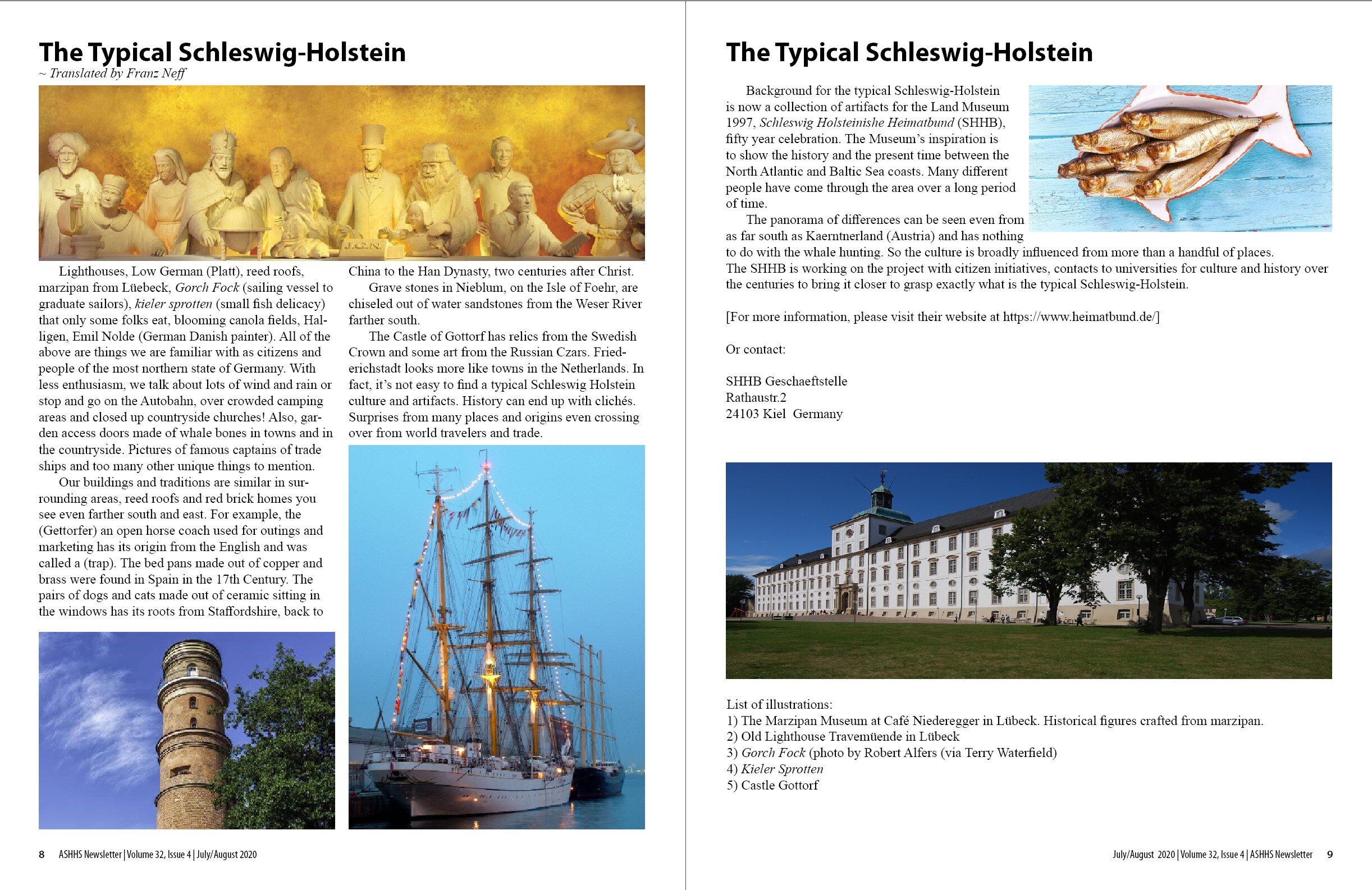
Using Negative Space
The left page has three pictures and text. It seems a little overpowering. But the right page has two pictures, less text, and negative space, a powerful but under-utilized design tool. The left page pulls the reader in and the right page lets them out. I believe that the use of negative space creates a calm exit from a full opening. Negative space is a vital tool in design so as to not bury a reader under packed pages of content.
